UX Research & Redesign
Phoenix Theatre
We audited and redesigned the Phoenix Theatre Company website so patrons could find a show, pick seats and check out without second-guessing every step.
Problem
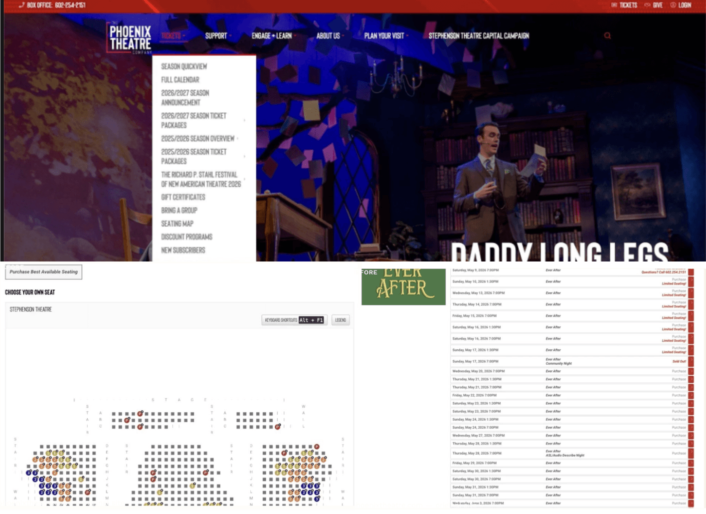
People could finish their tasks, just not confidently. A cluttered tickets menu, a seating chart with no stage or prices, and a checkout with no progress indicator caused hesitation in almost every session.
Solution
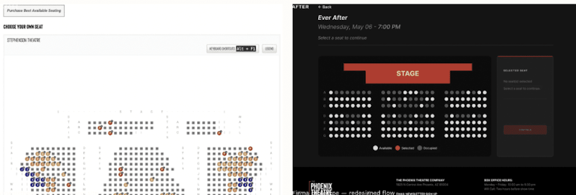
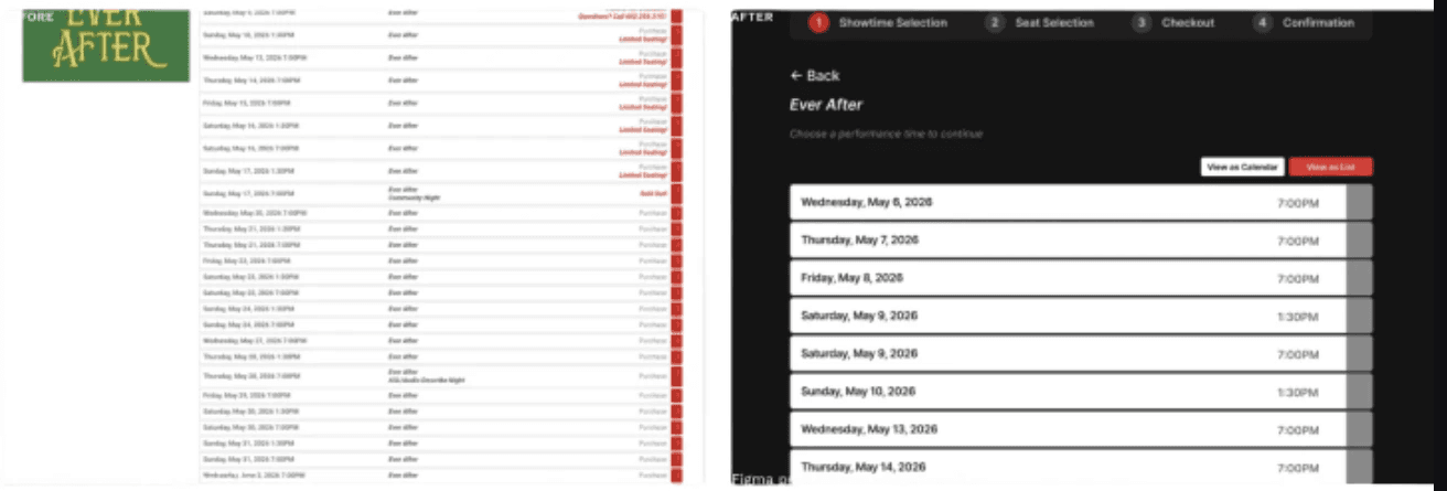
We rebuilt the purchase into four clear steps (Showtime, Seats, Checkout, Confirmation), added a calendar/list toggle for browsing, and made seat selection show the stage, seat states, and price before anyone commits.
Context
The Challenge
The Phoenix Theatre Company website is where people discover shows and buy tickets for live theatre in Phoenix. Everything technically worked, but the experience kept breaking down at the moments that mattered most: browsing, choosing seats, and paying.
The three of us ran a full UX cycle, from heuristic evaluation and a patron survey to personas, moderated usability testing, and a fully prototyped redesign.
Discovery
Four Phases of Research
We started with independent heuristic evaluations against Nielsen's 10 heuristics, then validated what we found with a survey of 20+ patrons. Survey patterns shaped three personas: first-time visitors, season ticket holders, and group bookers. Finally, ten participants worked through three think-aloud tasks: finding show info, browsing shows, and buying tickets.
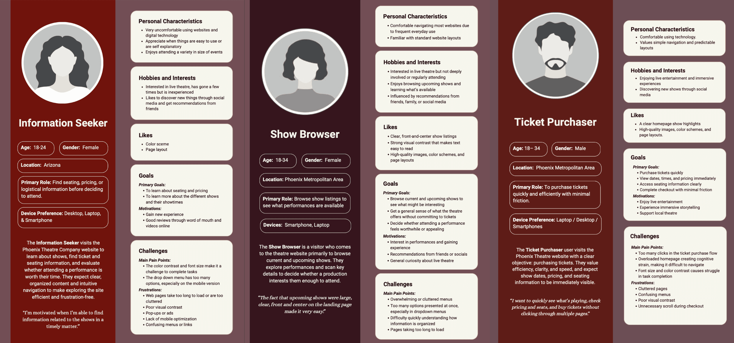
Phase 1 / 2
Users weren't failing. They were navigating by trial and error through a system that assumed they already knew where to look.
20+ survey responses · 10 usability sessions
Usability Findings
Where the Site Breaks Down
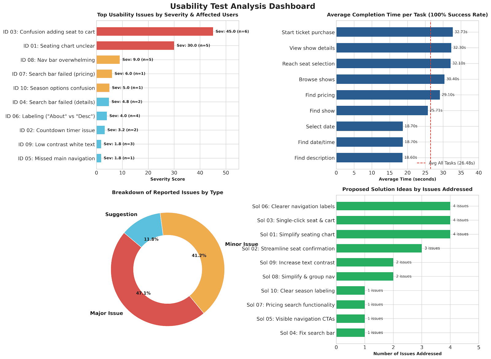
The same three patterns showed up across all ten testing sessions.
Critical
Seat selection leaves people guessing
60% of participants struggled to add seats to the cart. There was no stage label, no clear seat states, and no visible pricing.
Major
Navigation overload
The TICKETS dropdown held 11 nested options. Half the participants found it overwhelming and explored by trial and error.
Major
Checkout with no sense of progress
Too many steps and no progress indicator. 6 out of 10 participants hesitated or gave up mid-flow.
Major
Information without guidance
The right information was there, but nothing told people what to do with it next.
Ideation
From Friction Points to Design Decisions
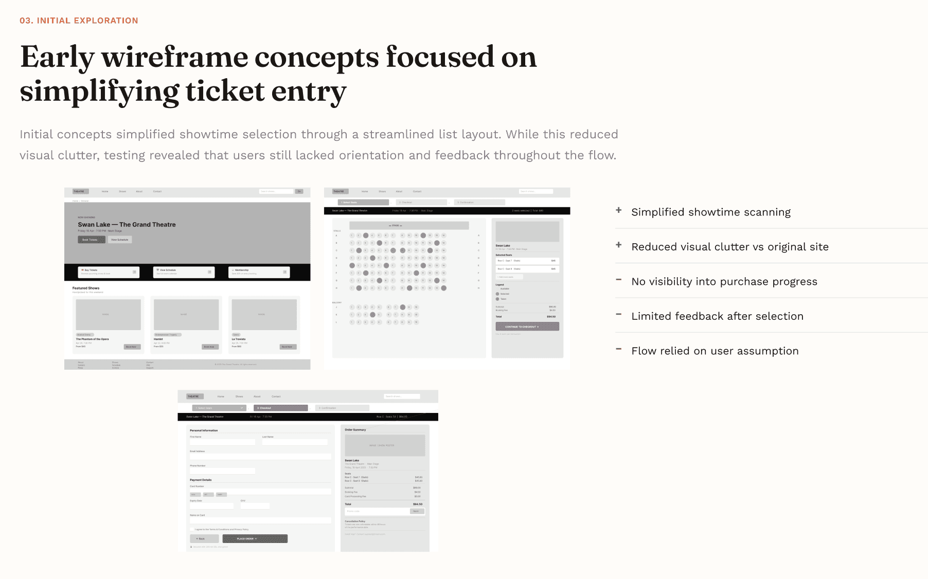
Every change mapped to a finding, and nothing went in without evidence. Seat confusion led to a stage label, distinct seat states and inline pricing. Navigation overload led to a streamlined top bar with a persistent cart. Checkout friction led to a four-step flow with a progress indicator.
Testing also showed two ways people choose a showtime: some plan around their calendar, others just scan for any open date. So we wireframed and tested both, and both made it into the final design as a toggle.
Redesign
Three Screens, Rebuilt From Research
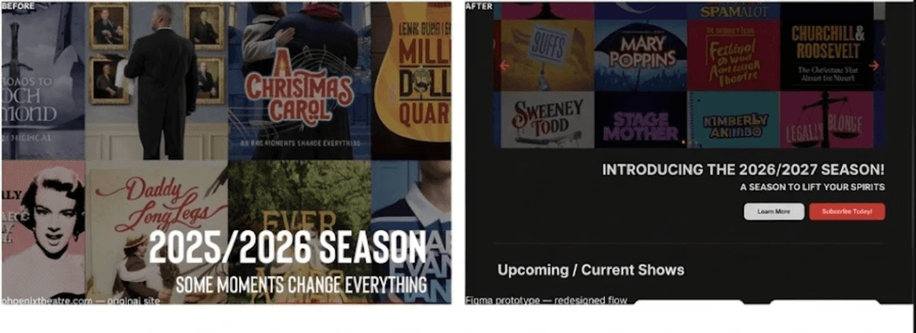
The redesign focused on orientation, visibility and confirmation: people always know where they are, prices and seat status are never hidden, and every key action gets acknowledged.
Homepage
Showtimes
Seat selection
Deliverables
What We Delivered
Heuristic report
Findings against Nielsen's 10 heuristics with severity ratings.
User research
A 20+ patron survey, 3 personas and 10 moderated sessions.
Redesigned flow
A guided 4-step purchase: Showtime → Seats → Checkout → Confirmation.
Interactive prototype
A fully clickable Figma prototype of the new experience.
Outcome
What's Next
What was delivered
- A fully clickable Figma prototype of the redesigned purchase flow
- A heuristic report and usability recommendations
- 3 personas from 20+ survey responses
What I'd test next
- Re-run the same 3 usability tasks on the redesign
- Compare seat-selection success with the original 60% struggle rate
- Measure checkout drop-off with the new progress indicator
Reflection
What this project taught me
Completion rates said the old site worked. Watching people use it said otherwise. The real problems lived in the hesitation, the backtracking and the guessing, and designing against those moments mattered more than adding anything new.