UI/UX Design · Game Interface
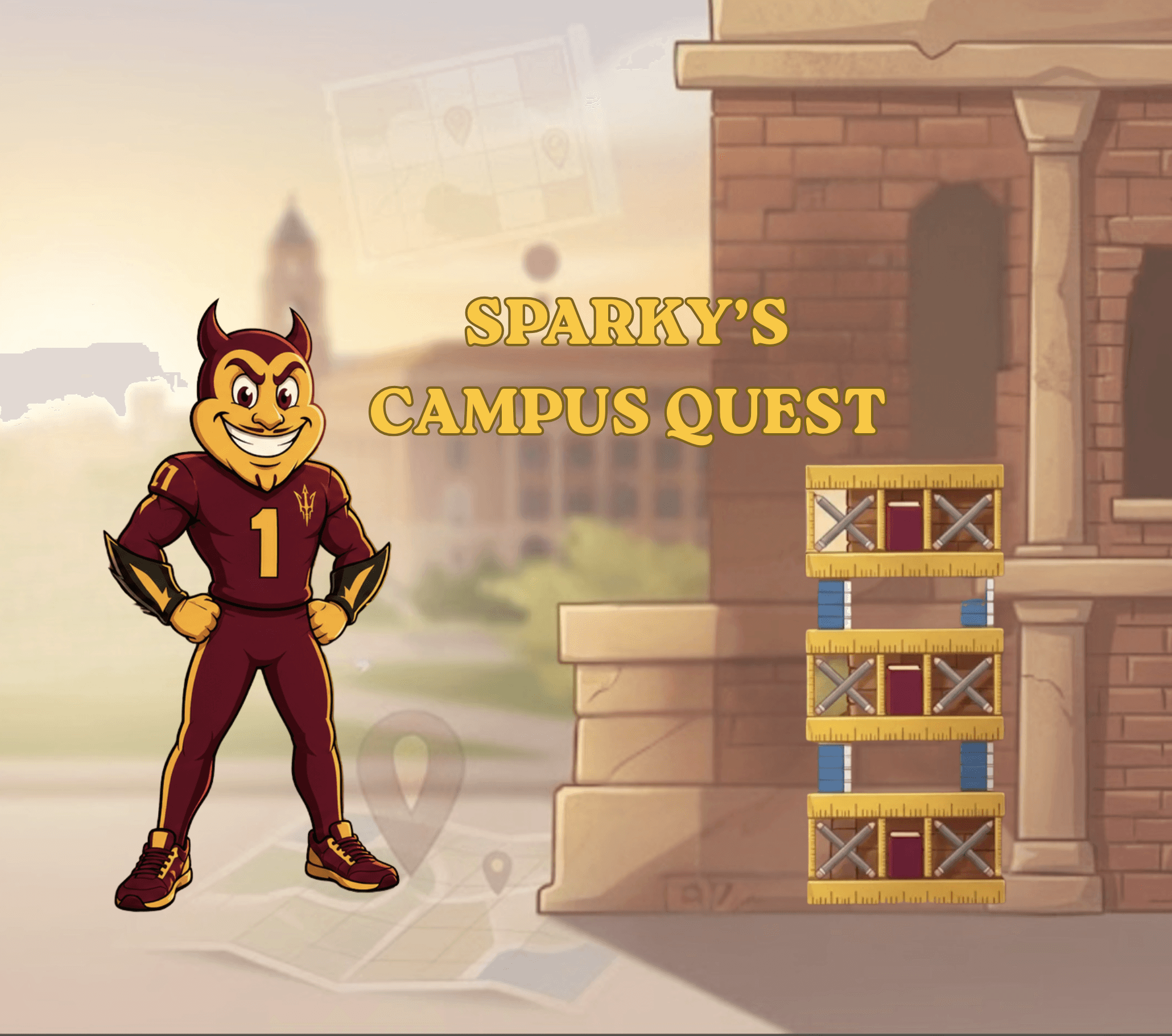
Sparky's Campus Quest
I designed every screen players touch in a Unity learning game for ASU's Learning Engineering Institute, from the question UI to the Figma-to-Unity handoff.
Problem
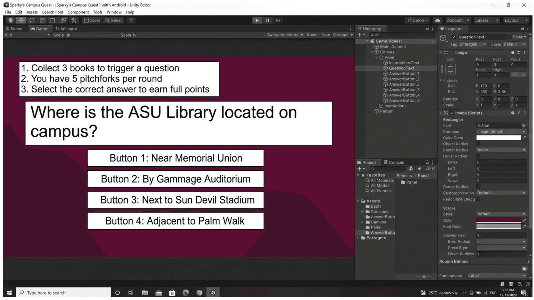
The game had solid mechanics and a well-researched KPI framework, but no visual design. Instructions were blocks of text, there were no interaction states, and the developers were building with placeholder art. Because wrong answers lowered a player's score multiplier, an unclear tap could actually cost them points.
Solution
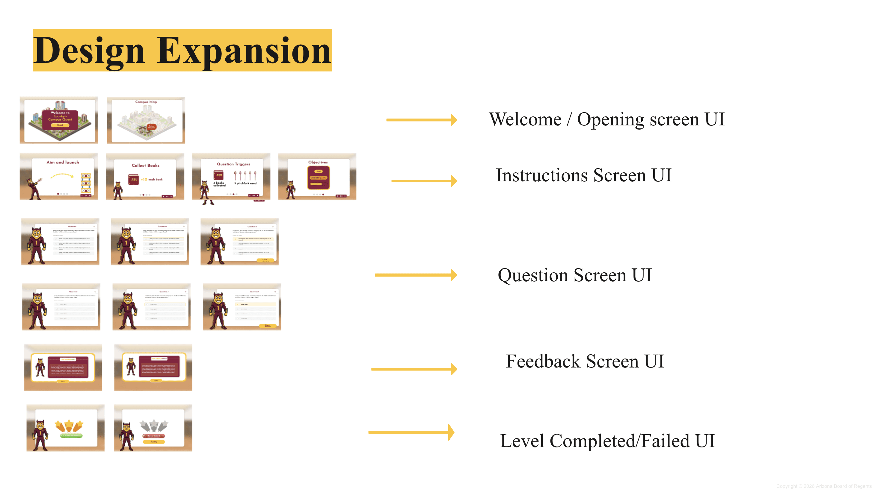
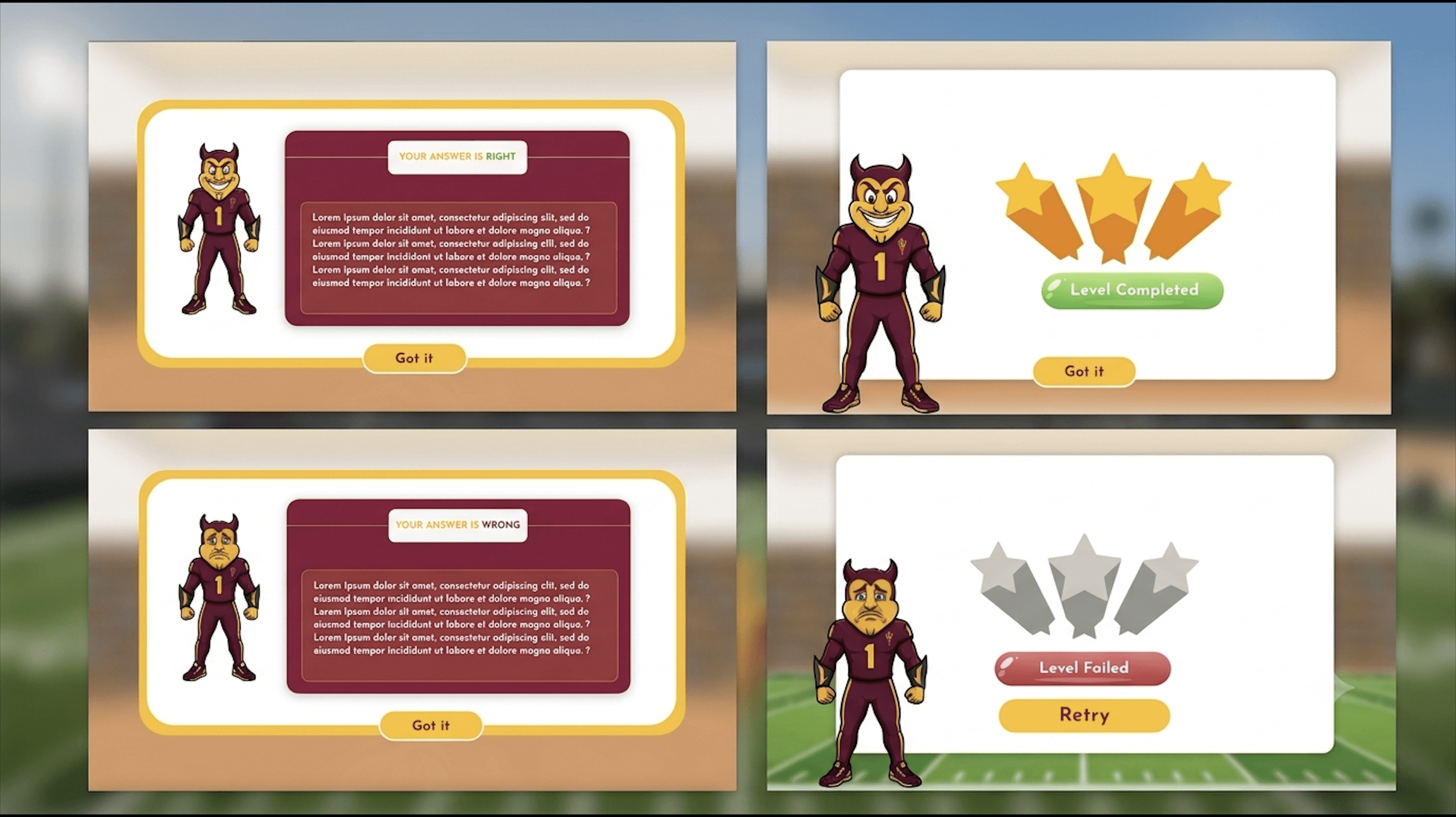
I designed the whole in-game UI around the game loop: a question screen with a "Check Answer" confirmation step, clearly separated interaction states, four feedback screens, and assets packaged so the Unity team could drop them straight in.
Context
The Challenge
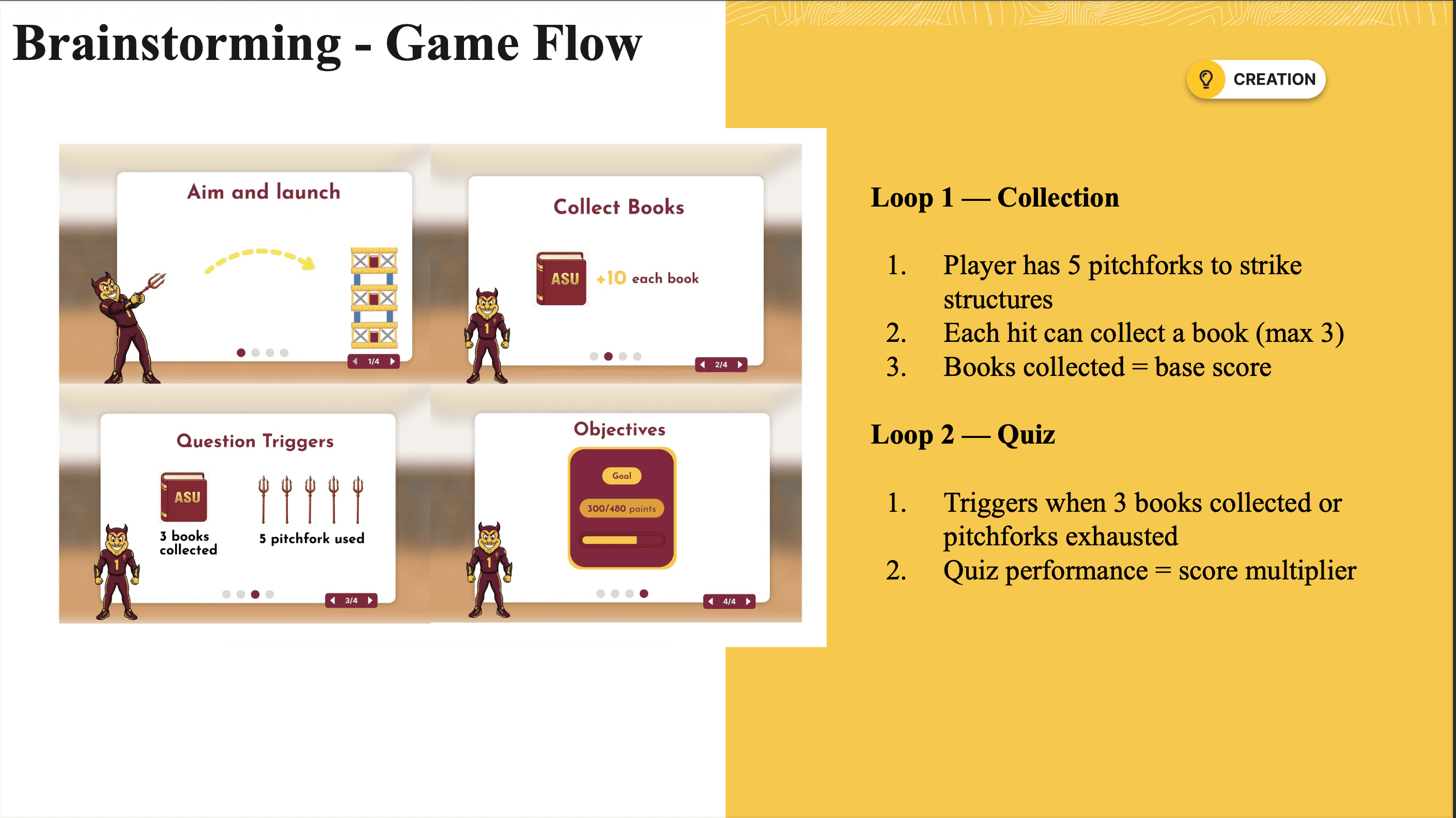
Players control Sparky the Sun Devil, launching pitchforks at Hayden Library to collect books and unlock knowledge questions. It blends physics-based gameplay with active recall.
I was the only designer on the team, so every screen the player sees was mine: the gameplay interface, the question and answer UI, every interaction state, and the feedback system. I also handled the full handoff from Figma into Unity.
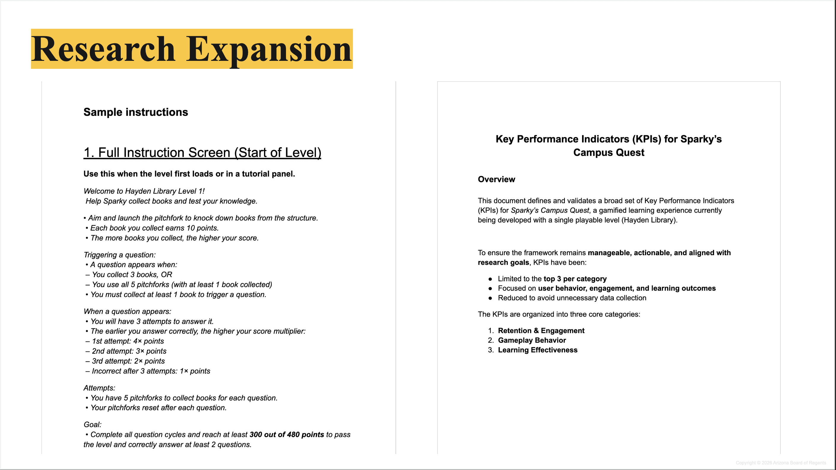
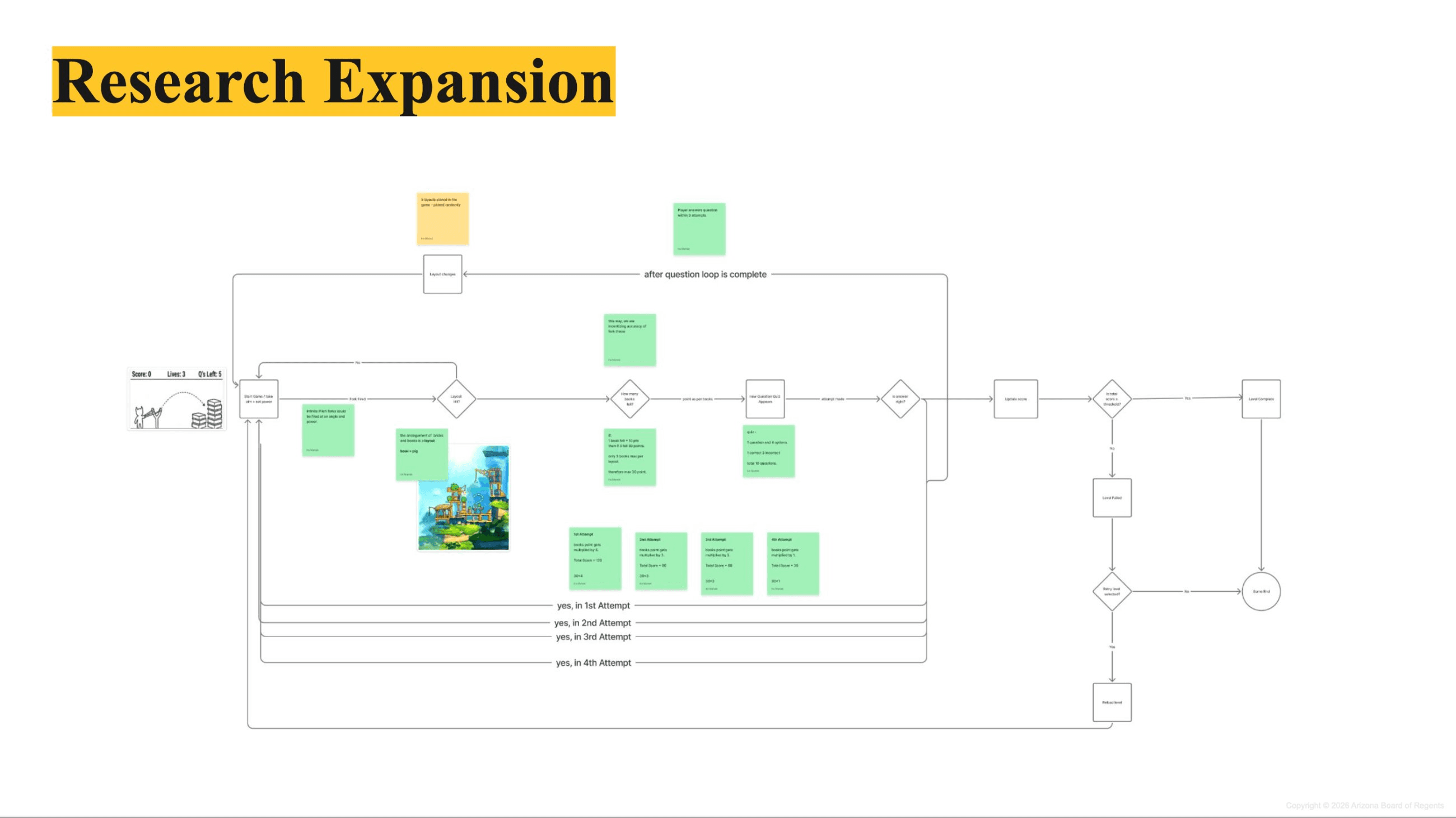
The scoring system rewards a correct first try with a 4× multiplier, dropping to 1× by the fourth attempt. That meant a confusing screen wasn't just annoying, it changed the numbers the research team was tracking.
Unity added its own limits. Full-screen overlays couldn't be rebuilt flexibly inside the engine, color-only states risked breaking on some displays, and the developers needed assets they could use without digging through Figma.
The Brief
What the Game Needed
01
Clear question UI
Every answer state had to be impossible to misread mid-gameplay.
02
Feedback that teaches
Right and wrong answers needed to reinforce recall without feeling punishing.
03
Unity-ready assets
Developers needed files they could drop in without opening Figma.
04
KPI-aligned
Every screen had to support the ≥75% completion target and the learning metrics.
Discovery
Understanding the Game First
Before opening Figma, I needed to understand three things: how the game loop worked, what the LEI KPI framework needed from the UI, and what Unity could reliably render.
The Hayden Library level runs a closed loop: launch, collect, question, answer, feedback, repeat. Four question cycles, five pitchforks each. Every element I designed had to support that loop without breaking its pace.
The biggest design risk wasn't how it looked. It was ambiguity.
Risk Audit
Where the Experience Could Break
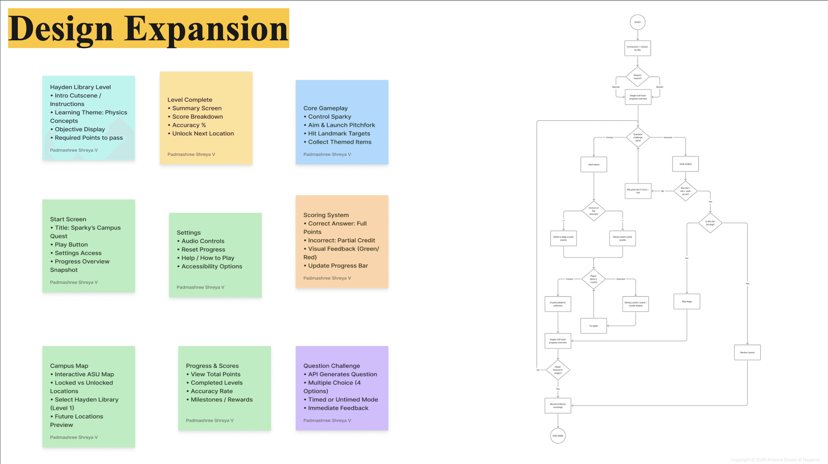
Before designing anything, I listed every point where a player could get confused, and what that confusion would cost.
Critical
Accidental taps cost points
The team had proposed instant feedback on tap. With attempt-based scoring, one mis-tap could cost a player their multiplier.
Critical
No interaction states
Nothing showed whether an answer was selected, registered, or wrong, so players had no way to tell if their input worked.
Major
Instructions as walls of text
Unstructured written instructions added reading load in the middle of fast-paced gameplay.
Major
Unity rendering limits
Full-screen overlays and color-only states weren't reliable in the engine, so the design had to work around them.
Ideation
Mapping Every State
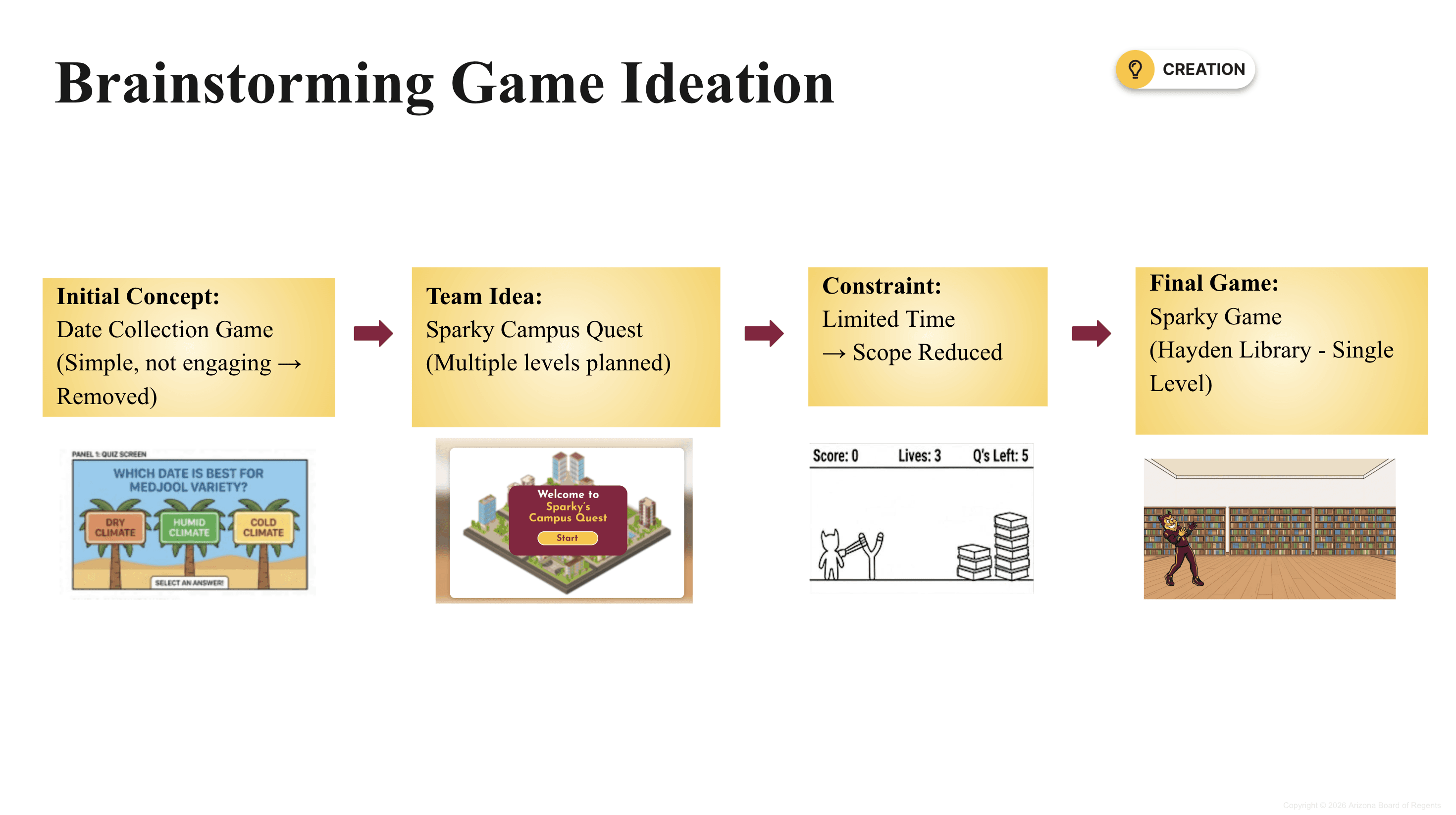
Ideation moved through three layers: narrowing the concept, mapping the game loop, then defining every state the UI had to handle. The project also shrank along the way, from a broader concept down to a single playable level, so every screen had to work inside that tighter scope.
Step 1 / 4
Design
From Figma to Unity
Every screen was designed against ASU's gold-on-maroon palette, with book-inspired details drawn from Hayden Library. The goal was simple: a player should never have to wonder what just happened.
Question UI
Feedback states
Final screens
KPI Alignment
Every Screen Maps Back to a KPI
- Clear question UI. supports the ≥75% level completion target.
- Check Answer step. protects accuracy by preventing accidental taps.
- Distinct feedback states. reinforce correct recall for learning effectiveness.
- Visual instructions. replace text to reduce cognitive load and support session duration.
- Accessible states. keep the data clean by preventing UI confusion from looking like gameplay errors.
Deliverables
What I Handed Off
In-game UI
Every player-facing screen for the Hayden Library level.
Interaction states
Five answer states plus a Check Answer confirmation step.
Feedback system
Correct, wrong, level complete and level failed screens.
Unity handoff
Packaged assets the developers could build with directly.
Outcome
What's Next
What was delivered
- Full in-game UI for the Hayden Library level
- Five answer states plus a "Check Answer" confirmation step
- Four feedback screens (correct, wrong, level complete, level failed)
- Packaged Figma-to-Unity assets for the developers
What I'd test next
- Measure level completion against the ≥75% target in playtests
- Compare accuracy with and without the confirmation step
- Track learning gains alongside the research team
Reflection
What this project taught me
Designing for a game taught me that clarity can be a scoring mechanic. When one mis-tap costs points, ambiguity stops being a style problem and starts showing up in the data. A single confirmation step did more for accuracy than any amount of visual polish.