UX DESIGN · AI CHATBOT
Arizona Water Chatbot
Arizona's water information was scattered and full of jargon. As a UX designer on the team, I audited the existing chatbot, shaped how it should respond, and tested it with residents.
Problem
For almost two decades Arizona has faced drought and a shrinking Colorado River, yet reliable water information is scattered across websites, written in technical language, and hard to trust.
Solution
A conversational assistant that answers common water questions in plain language, points to official sources, defers when it can't be certain, and always keeps an emergency path visible.
CONTEXT
The Challenge
For the last 19 years, Arizona has faced water-supply issues from drought and the declining Colorado River.
The information residents need does exist, but it's scattered across agencies, labs and news sites, and most of it is written for experts.
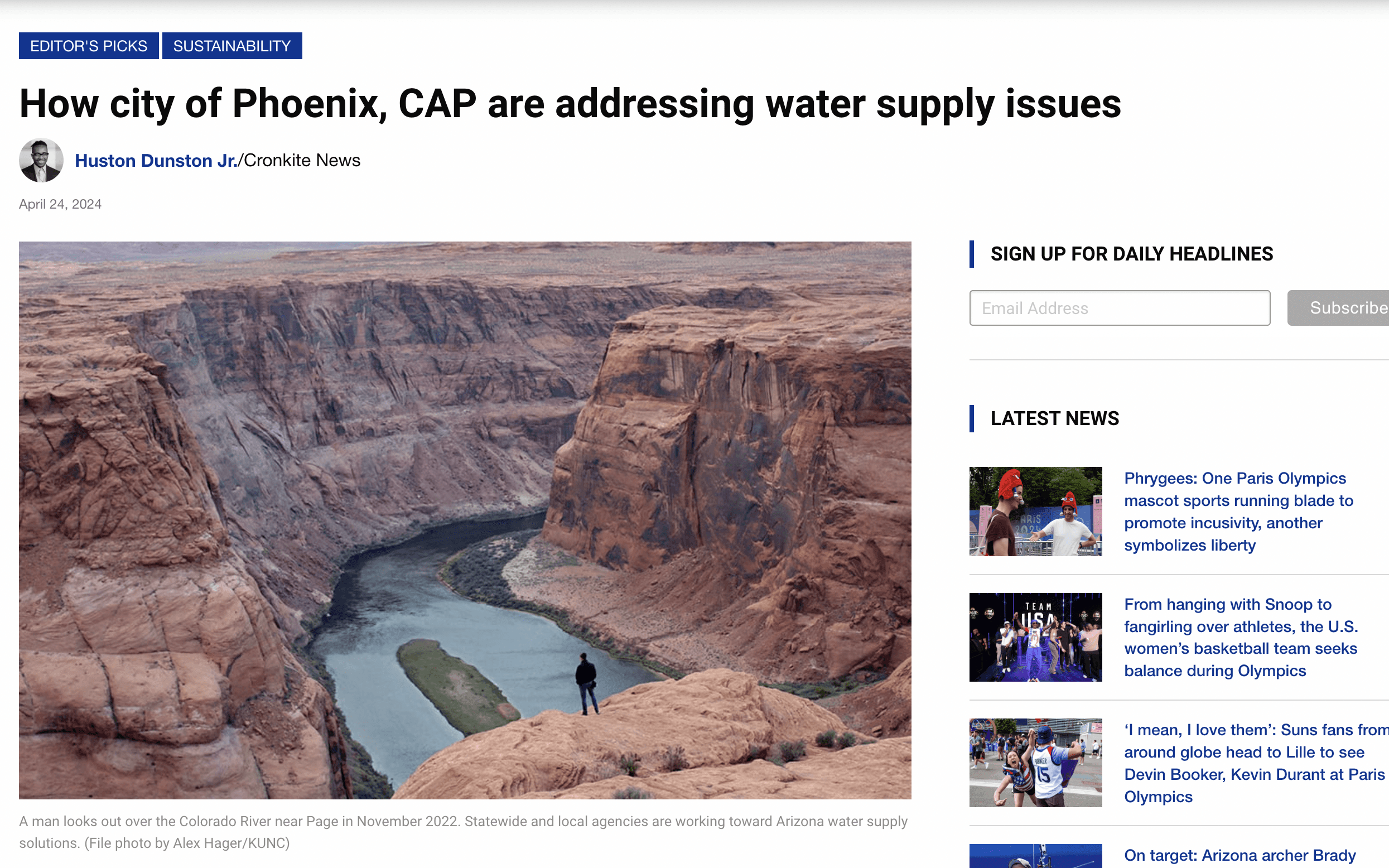
How might we design a quick and easy way for Arizona residents to access accurate water scarcity and conservation information?
THE BRIEF
What the Chatbot Needed
01
Plain language
Answer common drought and conservation questions without jargon.
02
Honest sourcing
Point people to official sources instead of sounding more certain than it is.
03
Clear limits
Know when to defer, and say so.
04
Always-on safety
Keep emergency help visible in every state of the conversation.
AUDIT
Where the First Version Fell Short
I audited the existing chatbot against usability heuristics and compared it with ChatGPT, Copilot, Bard and others. Edit, pause and response feedback were standard everywhere except ours.
HIGH
No way to stop or fix a request
Typos meant waiting out a wrong answer.
HIGH
A blank box for first-timers
New users didn't know what to ask.
HIGH
Answers couldn't be reused
No copy, share or edit.
MEDIUM
No voice input
Typing was the only way in.
MEDIUM
Bot and site navigation blurred
Controls looked like the lab's menu.
LOW
Dead-end follow-ups
'Would you like to know more?' wasn't clickable.

CONVERSATION DESIGN
Answer, Defer or Route
My main design work was deciding how the bot should behave depending on what was at stake, from suggested starter questions and quick replies to honest fallbacks when it couldn't be sure.
01
Answer
Plain-language responses to supported questions about drought, conservation and general Arizona water topics, with source direction.
02
Defer
When an answer depends on a current rule, a utility account or an unavailable source, explain the limit instead of guessing.
03
Route
For emergencies or unsafe situations, keep Emergency Help persistent and send people to official support, never attempting a diagnosis.
TESTING
What Residents Showed Us
Participants worked through four scenarios: local water use, future availability, water quality and a question of their own.
FINDING
'Action Items' went unnoticed and wasn't understood
→ Rename it and add short hover descriptions.
FINDING
People got distracted waiting for answers
→ Stream the response as it generates.
FINDING
The bot repeated an earlier detailed answer
→ Clear history when starting a new chat.
FINDING
People started typing without clicking the box
→ Focus the text field by default.
These results cover findability. Language comprehension wasn't measured.
DESIGN
From Findings to the Team's Redesign
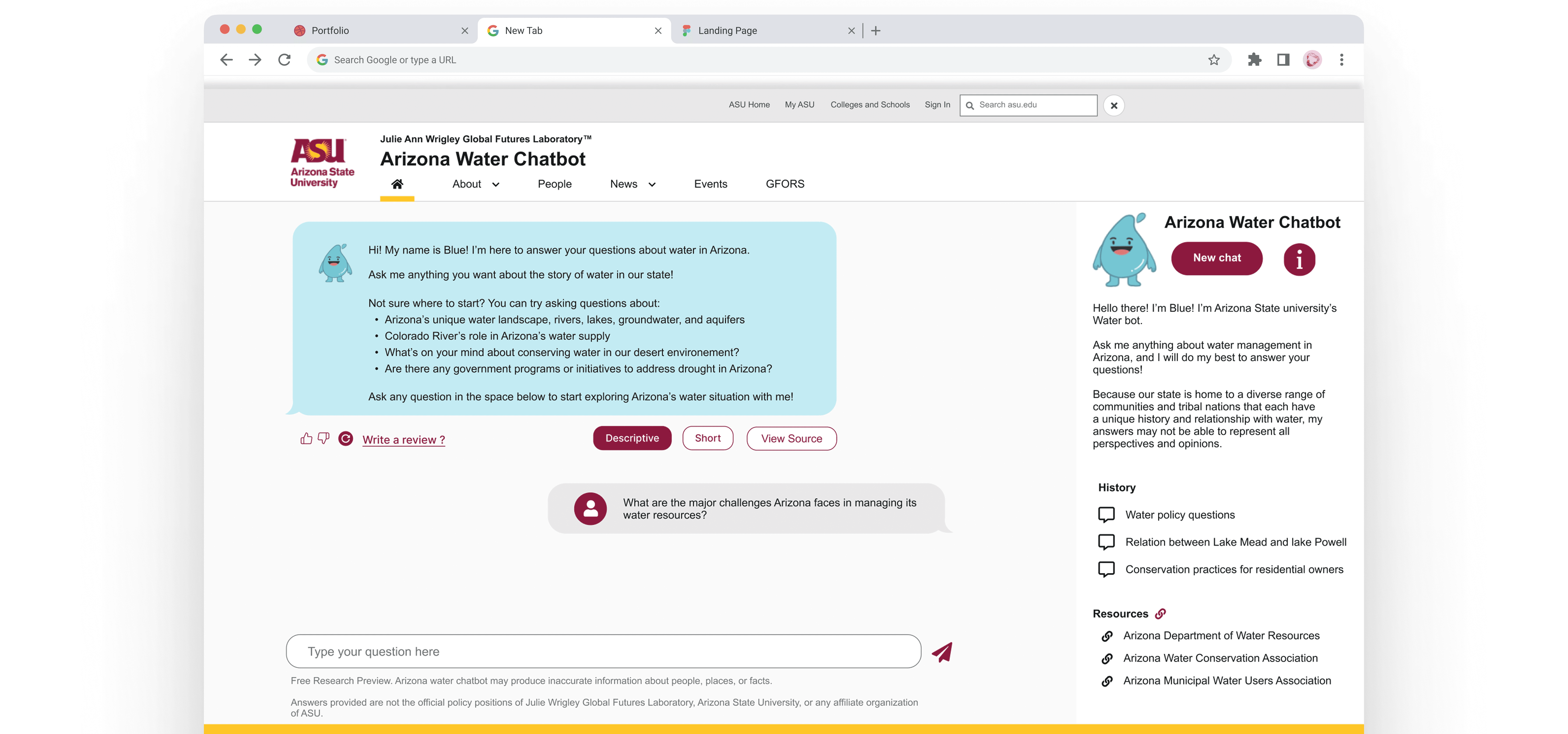
I wasn't the visual designer, but these findings directly shaped the team's redesign.
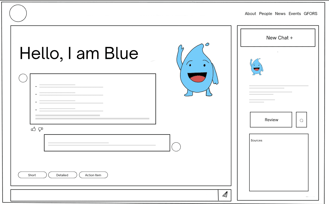
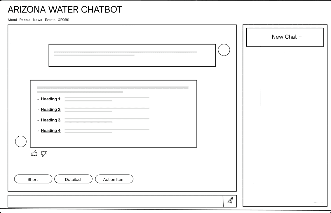
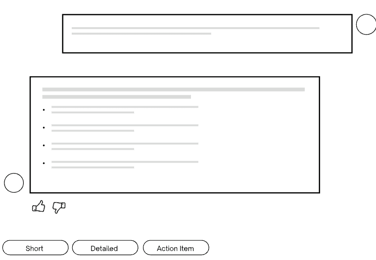
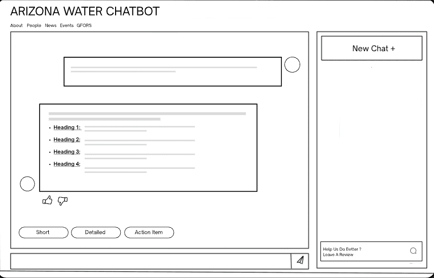
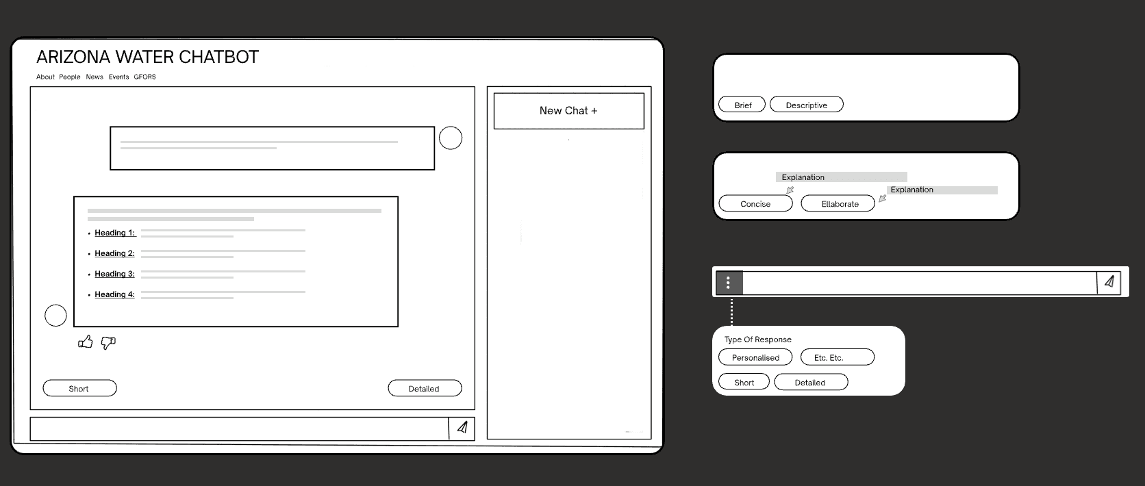
Sketch 1 / 5
- View Source under every answer. a direct response to the need for trust.
- Clearer chatbot identity. 'Arizona Water Chatbot' became the main heading.
- Simpler Short / Descriptive modes. with hover explanations.
DELIVERABLES
What I Contributed
Heuristic audit
Six rated issues, each paired with a fix.
Competitive analysis
Six chatbots compared on the patterns users expect.
Conversation flows
Answer / defer / route rules, fallbacks and quick replies.
Usability testing
Four scenarios, findings and recommendations for the team.
Reflection
What this project taught me
Working on a chatbot taught me that the failure states are half the product. It's easy to design for the perfect question. The harder, more important work is deciding what the bot says when it doesn't know, when the stakes are high, or when someone needs a human source instead. Getting those moments right is what made the good answers believable.